USER (un)FRIENDLY
Gripes and unexpected pleasures.
USER FRIENDLY | Separate cabin for small children in ICE trains

In ICE trains (fast German trains), they often have a separate cabin that you can sit in if you have little kids. This is so that your kids can run around, cry, play, etc. without you having to worry about it because it is a space designated for it. I don’t think we’re going to get kids to stop running around and being loud any time soon, so it makes a lot more sense to design the experience around this fact.
This is similar to ‘Silent’ sections on trains, where passengers are encouraged not to take phone calls or speak loudly, just applied to a different group of passengers. Having a space where kids can make noise and move around makes the journey better for everyone – for the kids who will get told off less, for the parents who may feel bad about disrupting other passengers and for the other passengers who probably don’t want their journey to be accompanied by a loud child (cute as they may sometimes be). I imagine an added benefit is that you get to meet other families with kids, and that maybe the kids also find playing buddies.
Make it (even) better!
I haven’t been in one of these cabins so I can’t really comment on how well it works or whether there are enough of them in regards to demand. I remember first seeing this 2 years ago when I moved to Germany and I have been using it as an example of what makes living in Germany nice. It’s this type of attention to detail that I think you would not necessarily think of yourself, but actually makes everyone’s day a bit better.
USER UNFRIENDLY | Zones and fares for public transport tickets
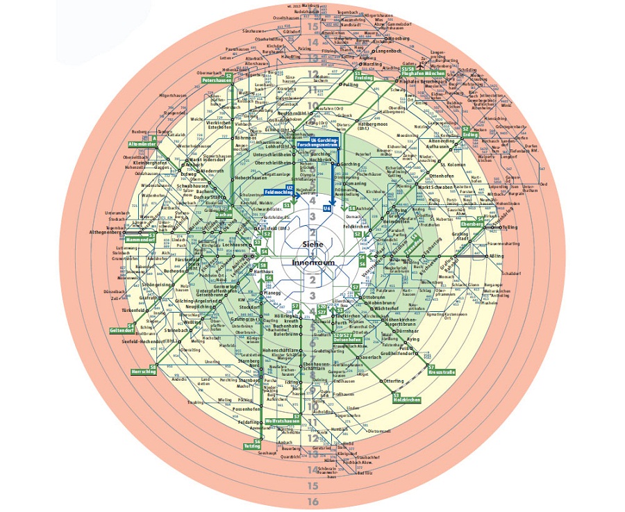
I’m not sure about other cities, but in Munich, the public transport has both rings and zones. It’s often unclear to me, what the difference between the zones and rings is and what ticket I have to order (i.e. how many rings or zones need to be incorporated). This is usually fine because I am mostly traveling within the city center, which is usually a set price, but I am always unsure if I have bought the right ticket.
Make it better! Consolidate the zones and rings into one system for the user. Right now, I don’t understand what the relationship between them is and how they affect ticket prices. I also wouldn’t mind having some ticket recommendations. For example, if I am buying a single ticket to a destination, I would appreciate it if a note popped up in the App asking if I was coming back the same day and recommending the day ticket, which might be cheaper. I know this may not make sense for the system in terms of money, but it would be a nice feature for the user.
USER UNFRIENDLY | Buying a ‘monthly’ public transport ticket in San Francisco

A while back, I did an internship in San Francisco for about 6 weeks. I wanted to get a public transport ticket, and thought the best one would be a monthly ticket. I knew I would spend the beginning of my time there walking around and exploring little side streets, so I planned to get the monthly ticket for my last four weeks there. I went ahead and bought the ticket when I knew I had a month left in the city, but to my surprise, the ticket stopped working after two weeks. That’s how I found out it was only valid for a calendar month, and not a month’s worth of travel! My mistake was thinking that the ticket would be valid for a month’s worth of travel, when in reality it was valid for calendar months. For example, if you bought a monthly ticket on February 16th, it would only be valid until March 1st. Even though I guess this is a ‘monthly’ ticket in a very literal sense, I was really upset to figure this out and felt really taken advantage of.
Make it better! I would make the tickets valid for a month of travel, calculated from the day the ticket is bought. This allows people more flexibility in regards to how they use the ticket, and might even encourage more people to buy the ticket and use public transport more because they are able to fit the 4-weeks of validity around their schedule. If this change would for some reason not be made, it’s important to inform people about how long their ticket will be valid for when they make the purchase. That way, they will be able to make an informed decision and not have an unpleasant surprise when they realize the ticket they thought would be valid for 4 weeks is actually only valid for 2 weeks.
USER UNFRIENDLY | Paying for public transport

Act 1: One of the first times I visited Munich (a few years back now!), we got onto the bus and, knowing that we would be out and about all day, wanted to buy two day tickets. There was no ticket machine at the bus stop so the only option was the ticket machine in the bus, which only took coins… A day ticket cost somewhere between 6 and 7 euro at the time, so the only way to pay would be to have 12-14 euro in change on us, something that most people try to not carry around with them. This put us in a strange situation, where even though we had money (in bills or cards) and wanted to pay, we had to ride without paying until we made it to a U-Bahn station where the machines also accepted bills and card.
Act 2: We were in London and it was pouring down rain while we were waiting for the bus. The bus eventually came and we tried to get on. This time I had both coins and bills to pay but the bus driver said he can’t accept coins or bills, and that the only valid payment is an Oyster card or contactless bank cards, neither of which I had on me. Again, a situation in which I had money and wanted to pay but couldn’t. Thankfully, a kind stranger stood up and payed with his contactless card and I ended up giving him the money, but it was still a frustrating experience in which I had money and wanted to pay but there were barriers in place.
Act 3: Fast forward a few years and Munich has already made big improvements. There are now apps for purchasing your public transit ticket, but there are TWO Apps in Munich and I’m not sure why this is the case and if there is any difference between them. This remains confusing. Some of the newer buses and trams also have more modern ticket machines that you can use to pay with card. I usually walk or ride my bike, but when the weather is bad I’ll sometimes buy a weekly or monthly public transport ticket, which is something you sadly still cannot do on the App. That means I have to walk out of my way to a U-Bahn station in the bad weather, which kind of defeats the point of getting a ticket in the first place.
Make it better! For Munich: Update all of the machines (I know this takes time and costs money, and I’m sure you’re on it) on the buses and trams. Consolidate everything into one App. Allow people to also buy weekly or monthly tickets on the App.
Generally for public transport: Find ways to make it easier for people to pay. There are currently often too many barriers in the way, even when people have the money and want to pay. This probably leads people to often ride without a ticket, even if their intentions are good, and ultimately costs the system money.
USER UNFRIENDLY | Location and routes on buses
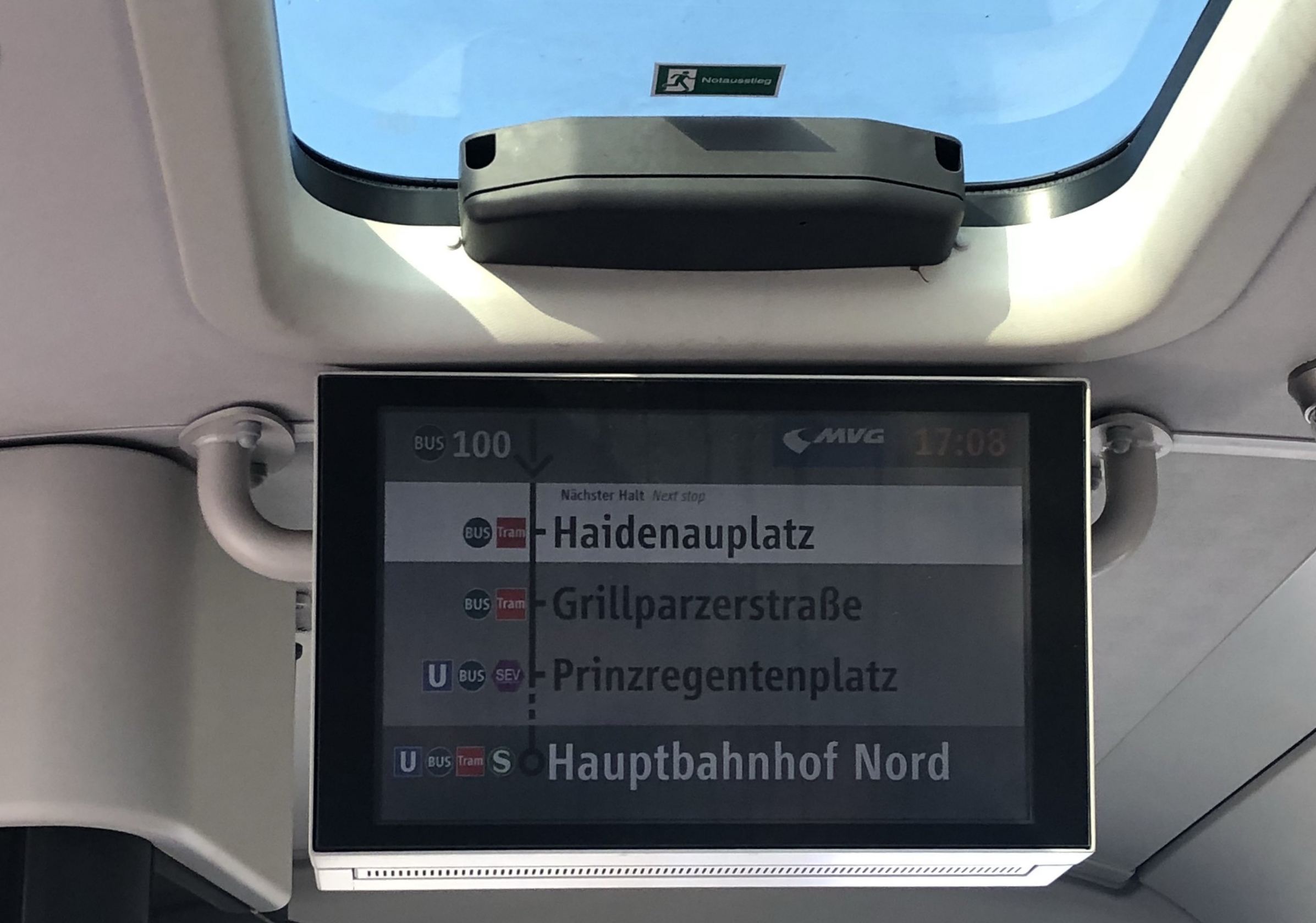
Munich is a great exception here and I have seen a lot more buses in cities improve this in the past few years, but one of my main concerns when taking a bus is not knowing exactly where the bus goes and when I need to get out. When you take the train or tube/subway, the stations are clearly marked and there is often a map of the journey to help you locate where within the journey you are and when you need to get out. However, many buses do not have an easy-to-read map, and do not signal the names of the stations in writing, or which stations are upcoming. This makes the journey a bit more stressful. I then do not listen to music or podcasts or look out the window because I’m worried about missing my stop, because I have no markers of when it might be coming. This is particularly frustrating when you are a tourist and may not have internet to follow your journey along on your phone.
Make it better! Be like Munich (and other cities) and show the stops on a display, with a list of the upcoming stops showing you the progress of your journey. In addition, a map that displays the stops similarly to how they are displayed for the metro helps you get an overview of all of the stations.
USER UNFRIENDLY | Getting out of the bus

This one may just be me not having figured out how buses operate yet. I know that when you ask for a bus to stop at a certain stop, you have to press a button (or pull a string). Two great things are that, at least in Munich, there are many buttons scattered around the bus so that you are always within easy reach of one, and that a display at the front of the bus (and sometimes a sound) give you feedback about the reception of your request. My problem comes when it’s time to get out of the bus. I go to the door, and it seems like sometimes all of the doors open automatically, and other times they are operated by you moving towards them, while in the rest of the cases you have to press the stop-request button again to get the door to open. I still haven’t figured out a general rule for how the bus door opens (and am not sure there is a consistent one) so you’ll often see me frantically pressing the stop-request button near the door before I’m about to get off the bus, just to make sure I can get out.
Make it better! Standardize the system! Either automatically open all of the doors at the stops (though maybe this has disadvantages in terms of energy or letting cold air in in the middle of winter) or make it clearer what I need to do to get out. It’s not a huge stress and I’ve never not managed to get out in time at my stop (though that is a fear in the back of my mind) but I would feel more relaxed knowing exactly what I need to do to get out.
USER FRIENDLY | S-Bahn in two different colors to indicate where the train will split

I don’t know about in the US, but in Germany and in the UK trains are often split, such that only one part of the train goes to the main destination and another part of the train detaches and only goes until a certain stop along the way. If you are sitting in one of these trains, you will likely hear announcements telling you that the front half of the train goes to this point and the second half goes to this point and to ‘make sure you’re sitting in the right part of the train.’ It’s often difficult to know if you are actually sitting in the right part of the train though and you are sometimes given little or no indication.
A while back, I was waiting to get on a S-Bahn to the Munich airport and I saw that the train was actually split into two colors. Half of the S-Bahn (that was going to the airport) was one color and the other half (that detached before the airport) was another color. This made me feel more confident about getting into the right part of the train and made the entire journey more relaxing.
Make it (even) better! Logistically, it may be difficult to coordinate trains to vary in color in this way, and I don’t think all of the trains are designated in this way. Still, it would be great to be given some sort of signal in the carriage you are sitting in that alerts you as to where your particular carriage terminates. I imagine it wouldn’t be so difficult to communicate this on the display system in each carriage that tells you the upcoming stops.
USER UNFRIENDLY | The lack of compatibility between Google MyMaps and favorites in the Google Maps App

Don't get me wrong - I'm very thankful to have Google Maps. I'm very glad the days of printing out directions before getting in the car are over and I heavily rely on Google Maps. Aside from getting directions, I use the Google MyMaps feature all the time. For those of you who have yet to use this feature – you can search for places and add pins with descriptions and save this under MyMaps in Google. I have maps for cities I’ve lived in so that I can readily send a friend who tells me that they are visiting a link with my recommendations. I also make maps when I am planning a trip so that I can keep track of places I want to visit. I sometimes even make maps after I have visited a place so that I can remember where we were, what I thought of the place and so that I can then share this information with friends who will later travel there.
Google MyMaps are great because they let you have different layers (e.g. I could make a layer for cafes and one for shops, etc.), add notes, change icons of the saved places, amongst other features. You can even add directions from place to place as part of a map (great feature!). The maps can be accessed in the Google Maps App but it currently is not very easy to save the map on your phone offline, meaning that the map is usually available only when you have internet (sometimes you can still see the markers offline if you just looked at it online, but you cannot access more of the information, such as place descriptions). This is a bit frustrating because I often use these maps when I am on-the-go. It is also not particularly easy to add places on your phone. Another point is that links that are written in the description of a place are not clickable, so you have to copy and paste the link into your browser instead of just clicking on it.
Another way to save places is to ‘star,’ or favo(u)rite places directly on the Google Maps App. If you look up a place in the Google Maps App, you can scroll up and click on the icon for save in order to mark this place with a star, flag or heart. This feature is a better way to save the places you like when you’re on the go, and it is also available offline. This feature is, however, limited in that you can only share these saved places individually as a link (i.e. I wouldn’t be able to share all of my stars for a city at the same time, only one at a time). I often star a place I walk by that I want to visit, and end up with a map of my favorite places in the form of stars in Google Maps, but I cannot easily share this map with others by sending them a link to all of the places I have starred. Instead, I have to go through and make basically remake this map in MyMaps by adding dropped pins so that I can share these places as a link.
Make it better! I don’t understand why these two systems are different (MyMaps and the save-a-place option in the Google Maps App) and I wish there was a way to integrate the two. For example, I wish I could upload my stars directly into a MyMap that I could share with friends, instead of having to do this manually. I would also appreciate a way to have access to MyMaps offline in a more stable way (i.e. to download certain MyMaps within the Google Maps App and have this be available regardless of internet connections).
I would also love to be able to create a template with a legend that I have created in MyMaps. For example, I could have certain colors, layers, and icons associated with different types of places (i.e. cafes, shops, museums, restaurants), save this template and every time I create a new map, this template with my layers and color coding would pop up along with the empty map and I can start filling it out instead of going back and checking what colors or icons I used for different maps. Along these lines, it would be useful to be able to copy a map. Sometimes, I may want to slightly adjust something for a person I’m sending it to but I do not want to change the original map.
It would also be great if the notes on each saved dropped pin were hyperlink-friendly. I often add links in there for more information, or in order to know where I got this information and it would be more convenient to be able to click on these links directly instead of having to copy them and paste them into a browser.
USER FRIENDLY & UNFRIENDLY | Ticket checks and use of contactless cards for London trains

A few weeks ago, I spent some time in London visiting friends and having some good ol’ friend therapy (there’s nothing better). When we lived in Cambridge, we would always fly into Stansted Airport and take the train directly to Cambridge. This time around, however, I flew to Gatwick, an airport that has a many different connections to London. I got to the train station within the airport and was overwhelmed by the number of different trains going into London (a situation that was further complicated by the fact that most trains were operating with some sort of delay and it was difficult to know exactly when they would arrive or depart and to calculate which train would be the next reasonable one to catch). What’s more is, I had forgotten my Oyster card and knew I would have to queue for a ticket and I was also trying to calculate how this queuing time would factor into which train I chose (many different train companies operate in England and you often have to buy a ticket for a specific company).
As I was standing in front of the departures board trying to do calculations that gave me mild flashbacks of struggling in high school calculus class, an announcement came on reminding passengers they did not have to wait in line for tickets and instead could use their contactless card to swipe in at Gatwick Airport and out at their destination in London. Great! This solved some of my concerns (and some of the overcrowding in that area) so I swiped in (though with all of delays it was still difficult to tell exactly which trains on which platforms would be the next to leave). I finally boarded a train and a few minutes later a minor confusion and panic set in – I saw a ticket controller a few rows in front of me.
I started brainstorming what to tell him regarding my lack of ticket (there is no proof of you swiping in with your bank card) and, as anyone who likes to be well-prepared would have done, crafted a beautiful story to tell him. When he finally got to be I told him I started to tell him I had used a contactless card. I was expecting him to have some sort of machine that would somehow check whether I had indeed tapped in (I don’t know, I’m not a technical person) but instead he just asked to see my bank card. I thought this ceremonial request laughable. I could have shown any random card and it would have proved nothing. It made me think about how much the system has improved to deal with crowds by cutting the time needed to wait in line for tickets but how other aspects (i.e. ticket check) have not been updated or adjusted to deal with new forms of payment of changes in the system.
In general though, the system is very confusing, as witnessed by several passengers being told by the ticket controller that their ticket was only valid on another train company and that they would now have to purchase a new ticket valid for this train company on board. I have a difficult time believing that people intended to cheat the system (after all, they had bought a ticket) and the ticket controller spoke to them in an infantilizing way typical of someone who has little empathy for others who do not have the same expert level of understanding for a system as they do (‘The train company is clearly written on the ticket. You should be able to see that.’). Yes, the train company may be written on the ticket, but many people, especially those travelling to England from abroad, may have no understanding or concept of privatized train companies and in the hustle and bustle (and people herding) that occurs in these places, the system is far too complex for people to make sense of it.
Overall, I appreciate being able to tap in and out using my contactless bank cards. It eliminates the need for an extra public transportation card (which in my personal history ends up costing me, with it often being misplaced with still some money on it), and manages the flow of people more efficiently by cutting out some of the lines for tickets. However, I do think that the system still has room for improvement. Aside from the comments above, I also found myself wondering how much my journey would cost. The tube does have certain prices, but especially when using contactless on a train journey, the prices can vary drastically. There was never any indication of how much the journey cost until I checked my bank statement the next day. I don’t have a crystalized solution for it (especially with so many different companies operating transport systems, and with prices varying on how many trips you take, etc) but as a consumer I would definitely like more transparency about pricing so that I can make an informed decision.
Make it (even) better!
Find a more effective and relevant way to check ticket validity or get rid of the superfluous ticket checks. Help people understand the differences between the train companies more or create some sort of barriers to prevent them from making the wrong decision as frequently as they do (This is a complicated one. Like I said, I think it is a very complex system and it is a difficult problem to solve). Make the price being charged with a contactless card more transparent.
USER UNFRIENDLY | Helping with choice using Google Maps

Overall I think Google Maps is great. I use it all the time and will likely do some other stories about features I like or others I think can be improved. However, related to the Gatwick story above, I was given so many options for transport between the airport and my friend's place. It was overwhelming. I didn’t know which to choose and like I mentioned, I found myself standing before the ticket machines debating which option would be best. First of all, there are multiple train companies operating in England and they offer different prices and ticket types. I didn’t want to buy a ticket for a certain train company and realize that by the time I got through the gates and to the platform, that train was gone and the next incoming train would be from another company and I’d have to wait longer for it.
The London Underground is not the most pleasant place to be, and I am generally someone that favors walking so I was also looking at connections that would have fewer transfers and if need be, more walking. I know Google Maps already lets you apply certain filters to your search (i.e. fewer transfers, less walking, wheelchair accessible) but I think there is room for more filters. For example, ‘more walking.’ I, personally would like to take a journey to close to where I need to be and then walk the rest of the way and I would like to be shown these options.
Make it better!
I would love to see some more filters to help me choose the right journey. Alternatively, journeys could be recommended based on my previous behavior (is this already integrated to a certain level?). Also, for situations like the one above with various train options and different prices, it would also be useful to see the prices of the trips recommended to make an informed decision. For example, I would probably not want to pay an extra 10 pounds for a train that gets me there 10 minutes earlier and I would want this information when I am making a decision about which route to take.
USER FRIENDLY | Ensuring a stress-free snooze with Etihad and Emirates

We flew Emirates to a wedding in Australia and found three stickers in our seat pockets. One said 'Do not disturb,' another 'Wake me up to eat,' and the last 'Wake me up for Duty Free.' I loved these. I feel like they directly answered one of my main concerns when flying (I know, others have bigger concerns, like, how does a metal machine that weighs tons and tons float on air? or will we land safely?). However, whenever I fly longhaul I am stressed because of having to make the choice between snoozing or making sure I get something to eat (catching up on all of the movies also enters this equation). I know airplane food is not haute cuisine, but every now and then you do get ice cream and no one wants to miss out on that. Plus, I feel like I've already paid for it in the price of the ticket and I might as well get my money's worth. Emirates did not only answer this concern with the stickers, which you could place on the seat in front of you, they also provided a menu in the seat pocket, meaning that I was not only relieved to know that I could safely snooze and still get food, but I could also look forward to the meals and think about my food choice. This also makes the flight attendants' job easier by not having to repeat the food options over and over again (who can actually hear the airplane announcements on the scratchy speakers?).
I was so excited about the stickers and the menus and told our friends (read: semi-bragged) about it when we got to Sydney. They had flown over as well and it turns out that Etihad one-upped Emirates with this amazing sleeping mask above! Our friends showed us the mask and it instantly became one of my favorite things. 'Wake me up to eat' could be my motto in life.
Make it (even) better! One thing that still slightly stressed me out is not knowing exactly where to put the stickers. What if I didn't place it in the right spot and the flight attendant overlooked it? Similarly, with the eye mask, what if my head is down on my arms, and the flight attendant can't see the color of the mask? One easy solution could be to give clearer directions on where to place the sticker (i.e. have a designated area), or in the case of the sleeping mask, to also color the straps of the masks in order to be able to interpret the message if the person is sleeping head down. A better and more sophisticated solution would be to be able to digitally enter your preference using the interface on the back of your screen (you could also indicate your meal preference here, or if you only want to be woken up for a certain meal or snack).
USER UNFRIENDLY | United departure displays at Chicago O'Hare

I'd like to think I'm not stupid but the flight departure screens at Chicago O'Hare airport made me feel otherwise. Every now and then, you come across these displays, which only show United flights. I understand that United probably pays for these screens and thus only want to communicate information about their flights, but this is extremely confusing in an airport where multiple companies operate. I, for one, entered a mild panic when I couldn't find my flight on the board, and I had to ask a person at a desk to look up the gate for my non-United flight because I could not find information about it on any of the informational screens.
Make it better! Include flights from other other carriers as well! You can still use the platform to advertise United and highlight that the service is provided thanks to United. Airports are complex and it is difficult to display all flights, especially when the airport is a major hub like O'Hare. However, the most relevant flights for the terminal (from all airlines) should be displayed on a screen like this, and an interactive display could help serve users who need to search for information about a later flight or a flight in a different terminal.
USER UNFRIENDLY | Table of Contents of the book Universal Methods of Design

Universal Methods of Design is a good and comprehensive book covering research methods. The table of contents features a number system that outlines when in the design process the method in question is most relevant. I think this is a useful feature and am happy that is is included. However, I find it less useful that the methods are ordered alphabetically and not based on the relevant design phase.
Make it better! Order the methods based on the design phase that is most useful. The most important piece of information for a user here is not the alphabetical name of the method, but rather when they can use it. Of course, what complicates a design-phase ordering of methods is that some methods are useful at various phases. Still, here the methods could be described the first time they appear and they can be referenced with a page number when they are relevant for subsequent design phases. The index serves the purpose of helping users find methods alphabetically.
USER FRIENDLY | Bags that improve the experience of eating chestnuts on-the-go

I'm a sucker for roasted chestnuts. I love the comforting, hearty treat that pops up across cities as the weather turns cold and the warmth that comes from holding a freshly roasted brown bag. One problem that I usually encounter though, is what to do with the shells. I don't want to litter so I usually end up stuffing them into my coat pocket or bag until I find a trash can, but then it's often hard to get all of the small remnants and I end up finding them for weeks to come. Other times I return the shells to the bag and mix them with the not-yet-eaten chestnuts.
I was walking along the canal in Milan in autumn and of course, couldn't resist buying some chestnuts. To my delight, the bag included an extra pocket for the shells so that you can neatly separate the eaten and uneaten chestnuts and easily dispose of the shells at the end. Genius!
Make it (even) better! Bring it to the masses!
USER UNFRIENDLY | Lack of feedback when navigating websites with multiple pages

This is a classic. One of my biggest pet peeves are websites that give you no feedback regarding navigation. This particular example is from Deloitte Digital but it's not hard to find other examples. What's even worse, is that the double arrow at the beginning and end of the numbers do not take you to the page immediately before or after but rather to the very beginning or end. The only way to go to the next page is to keep track of the page numbers. Yes, you can do the math and figure out on which page you are but users shouldn't have to deal with that extra cognitive load.
Make it better! Show the user where in the navigation they are! Highlight or bold the number of the current page and add a single arrow on each side to be able to navigate one page forward and backward.
USER UNFRIENDLY | Not recognizing variations in writing (plurals and accents)

I've been on eBay Kleinanzeige a lot since we've moved into our new apartment. I appreciate that it allows people to connect and sell goods and services (in a similar way to Craigslist for those of you reading in the States). However, I've noticed that the website does not recognize or correct for slight misspelling or for differences in writing. For example, when someone cannot type an umlaut (the accent with two dots above a word) it is also acceptable to write an e after the letter (such that ü can also be written as ue). eBay Kleinanzeige does not recognize differences in writing such as these, though they are correct. Above you can see that if you search for Muenchen it does not recognize that you are trying to write München. I've also come across this problem in regards to plural and singular. Some German words take an umlaut in the plural form (chair:chairs, Stuhl:Stühle) but I have found that the website often does not recognize plural forms of a word and I have to do separate searches for singular and plural words.
Make it better! Change the algorithm to include some spelling adjustments or variations, especially for accents that may not be easy to type on every keyboard, and include variations of words in the search in order to cut down searching time. Someone who is looking for a chair is probably also happy to get results for chairS (but consider that maybe the opposite isn't true).